Stock Market Cycles
Learn how to identify and analyze market cycles using advanced chart annotation tools from StockCharts.com. Enhance your trading and investing strategies with insights into cyclical patterns.
Last updated
Learn how to identify and analyze market cycles using advanced chart annotation tools from StockCharts.com. Enhance your trading and investing strategies with insights into cyclical patterns.
Last updated
© StockCharts.com, Inc. All Rights Reserved.
A market cycle is an event, such as a price high or low, which repeats itself regularly. Cycles exist in the economy, in nature, and in financial markets. The basic business cycle encompasses an economic downturn, bottom, economic upturn, and top. Cycles in nature include the four seasons and solar activity (11 years).
Cycles can also be incorporated into technical analysis of the financial markets. Cycle theory states that cyclical forces—long and short—drive price movements in the financial markets.
Price and time cycles are used to anticipate turning points. Lows are normally used to define cycle length and project future cycle lows. Even though there is evidence that cycles exist, they tend to change over time and can even disappear for a while, similar to trends.
There is evidence that markets trend, but not always. A trend disappears when markets move into a trading range and reverses when prices change direction. Cycles can also disappear and invert. Cycle analysis won't necessarily pinpoint reaction highs or lows. But, if you use cycle analysis with other technical analysis tools, they can be helpful in anticipating turning points.
The image below shows a perfect cycle with a length of 100 days. The first peak is at 25 days and the second peak is at 125 days (125 - 25 = 100). The first cycle low is at 75 days and the second cycle low is at 175 days (also 100 days later). Notice that the cycle crosses the X-axis at 50, 100, and 150, every 50 points or half a cycle.
Crest: Cycle high
Trough: Cycle low
Phase: Position of the cycle at a particular point in time (the example cycle is at .95 on day 20)
Inflection Point: This is where the cycle line crosses the X-axis
Amplitude: Height of the cycle from X-axis to peak or trough
Length: Distance between cycle highs or cycle lows
Observe that this is merely a blueprint for the ideal cycle; most cycles are not this well-defined.
Cycle Length: Lows are usually used to define the length of a cycle and project the cycle into the future. A cycle high can be expected somewhere between the cycle lows.
Translation: Cycles almost never peak at the exact midpoint nor trough at the expected cycle low. Most often, peaks occur before or after the midpoint of the cycle. Right translation is the tendency of prices to peak in the latter part of the cycle during bull markets. Conversely, left translation is the tendency of prices to peak in the front half of the cycle during bear markets. Prices tend to peak later in bull markets and earlier in bear markets.
Harmonics: Larger cycles can be broken down into smaller, and equal, cycles. A 40-week cycle divides into two 20-week cycles. A 20-week cycle divides into two 10-week cycles. Sometimes a larger cycle can divide into three or more parts. The inverse is also true. Small cycles can multiply into larger cycles. A 10-week cycle can be part of a larger 20-week cycle and an even larger 40-week cycle.
Nesting: A cycle low is reinforced when several cycles signal a trough at the same time. The 10-week, 20-week, and 40-week cycles are nesting when they all trough at the same time.
Inversions: Sometimes a cycle high occurs when there should be a cycle low and vice versa. This can happen when a cycle high or low is skipped or is minimal. A cycle low may be short or almost non-existent in a strong uptrend. Similarly, markets can fall fast and skip a cycle high during sharp declines. Inversions are more prominent with shorter cycles and less common with longer cycles. For instance, one could expect more inversions with a 10-week cycle than a 40-week cycle.
The data points on a price chart can be split into three categories: trending, cyclical or random. Trending data points are part of a sustained directional move, usually up or down. Cyclical data points are recurring diversions from the mean. Diversions occur when prices move above or below the mean. Random data points are noise, usually caused by intraday or daily volatility.
Cycles can be found by removing trend and random noise from the price data. Random data points can be removed by smoothing the data with a moving average. The trend can be isolated by de-trending the data. This can be done by focusing on movements above and below a moving average. Alternatively, the Detrended Price Oscillator can be used (see below).
When looking for cycles, it's important to view price changes in percentage terms instead of absolute terms. On an arithmetic scale, an advance from 100 to 200 will look the same as an advance from 300 to 400. Even though both advances are 100 points, they are much different in percentage terms. A move from 100 to 200 is +100%, while a move from 300 to 400 is +33.3%. On a log scale, the move from 100 to 200 will appear much larger than from 300 to 400. The percentage change from 100 to 200 is three times larger. To properly compare price action over an extended period with larger price changes, it's ideal to use a log scale chart.
This eliminates the random noise and allows you to focus on the general movements. A short five-day simple moving average (SMA) is often adequate. Smoothing also helps define reaction lows when volatility is high, such as in October–November 2008 (see chart below).
This is perhaps the easiest way to find cycles. Find a few lows with the same cycle length and extend that cycle into the future.
The Detrended Price Oscillator (DPO) can detrend the price series. This indicator is based on a centered moving average, in other words, a moving average that has been displaced to the left by a factor (N/2 + 1). A 20-day DPO would be based on a 20-day moving average displaced to the left (past) by 11 days [(20/2 + 1) = 11)]. DPO would then be the closing price less the value of the displaced moving average. The resulting oscillator reflects price movements above and below this displaced moving average.
You can use oscillator dips to identify a cycle. The DPO ends before the last price because the moving average is displaced, and the DPO aligns with the displaced moving average. It often helps to set the DPO in line with the cycle length. Use a 10-period DPO for 10-day cycle lows or a 40-day DPO for 40-day cycle lows.
The chart below shows the S&P 500 ($SPX) with the DPO and Cycle Lines tool in log scale. The S&P 500 is displayed as a five-day SMA displaced three days. This puts the plot in the middle of the moving average period. A visual analysis suggests there is a three-month cycle at work. Therefore, the DPO is set at 65 days to confirm the anticipated cycle. The DPO turns negative every few months to confirm a recurring cycle at work. The blue arrows show the initial estimates for the 65-day cycle. The Cycle Lines Tool is then applied to evenly spread the cycles and project into the future.
Traders and investors often turn to cycles for their analysis. One popular cycle is the Presidential Cycle, which is based on the first and second half of the US Presidential term. This cycle is not infallible but has produced good results over the last 50 years. Stocks tend to rise generally, but the S&P 500 rose more during the second half of a US President's four-year term than in the first half.
The chart below shows the S&P 500 with the Presidential Cycle over the last 20 years. It starts with Reagan's first two years (1981–1982) and ends with Obama's first year (2009).
Yale Hirsch, founder of the Stock Trader's Almanac, discovered the Six-Month cycle in 1986. This cycle is one of the more popular on Wall Street. The bullish period extends from November to April, and the bearish period extends from May to October. The adage “go away and sell in May” stemmed from the six-month cycle. Sy Harding took the Six-Month and Presidential Cycles further by adding the Moving Average Convergence/Divergence (MACD) for timing. Buy when both cycles are bullish, and MACD turns positive. Sell when both cycles are bearish, and MACD turns negative. This is a great example of using other indicators with cycles to improve performance (see chart below).
Once identified and understood, cycles can add significant value to the technical analysis toolbox. However, they are not perfect. Some will miss, some will disappear and some will provide a direct hit. This is why it is important to use cycles in conjunction with other aspects of technical analysis. Trend establishes direction, oscillators define momentum and cycles anticipate turning points. Look for confirmation with support or resistance on the price chart or a turn in a key momentum oscillator. It can also help to combine cycles. For example, the stock market is known to have 10-week, 20-week, and 40-week cycles. These cycles can be combined with the Six Month Cycle and Presidential Cycle for added value. Signals are enhanced when multiple cycles nest at a cycle low.
When adding cycle annotations, measuring the first two cycle lows with vertical lines is sometimes helpful. For a 20 day cycle, place a vertical line on the first low, count 20 days and then place a second vertical line.
Start drawing the cycle annotation from the first vertical line and extend it to the second vertical line for the first 20-day cycle. The subsequent cycles will also be 20-days.
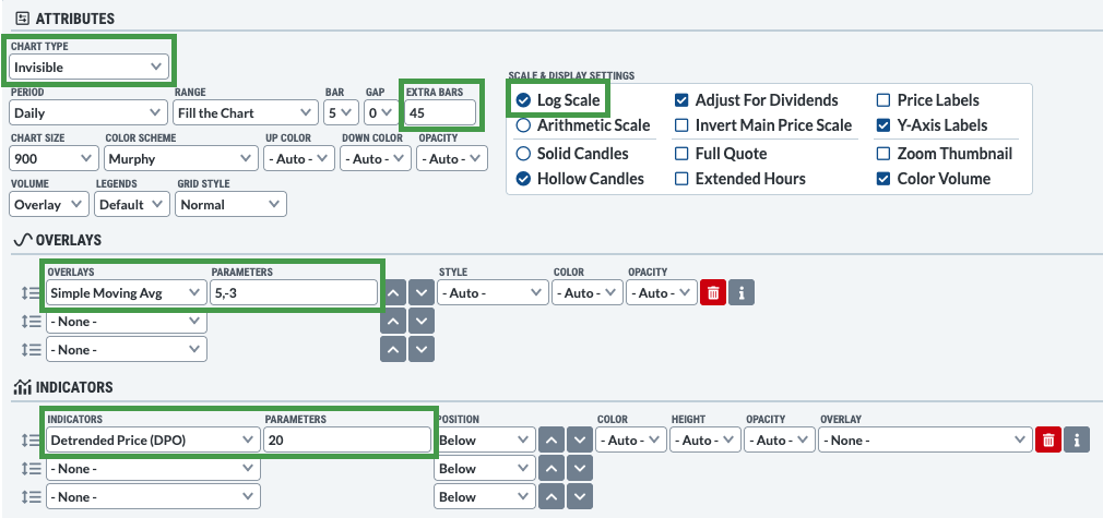
The steps below show the SharpCharts settings for cycle analysis.
Under Attributes > Chart Type, select Invisible from the dropdown menu.
Select the Log Scale button to view price moves as percentage changes.
It is sometimes necessary to add extra bars to the chart to extend cycle lines into the future. Type the number of bars in the Extra Bars box.
Add a displaced 5-day SMA as an overlay.
Add the DPO indicator below the price chart with 20 days as the parameter.
You can use our to add Cycle Lines, Cycle Circles, and Sinewaves to your charts. Below is an example of a chart annotated with Cycle Lines.
Learn More. To add Cycle Lines, Cycle Circles, and Sinewave annotations to your charts, read our Support Center article on .