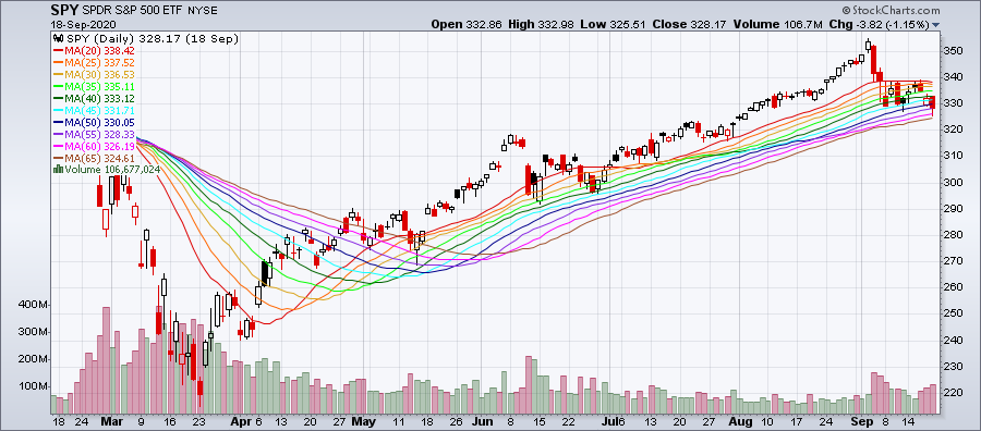
Moving Average Ribbon
A quick way to plot several moving averages with different look-back periods on a chart at once.
Last updated
A quick way to plot several moving averages with different look-back periods on a chart at once.
Last updated
© StockCharts.com, Inc. All Rights Reserved.
A Moving Average Ribbon is a graphical representation of multiple moving averages with varying look-back periods plotted on the same chart. It appears like a ribbon moving across the chart, hence its name.
These moving averages can be analyzed separately or as a group for trend identification and trend change signals.
Learn More. Moving Averages
There are no special formulas here; the Moving Average Ribbon is a quick and easy method to add multiple moving averages to your chart.
Determine the number of moving averages (MAs) to add and the number of periods for each. In StockChartsACP, this is accomplished by specifying the number of periods in the shortest MA, the increment in periods between each MA, and the total number of MAs in the ribbon. You may also specify the type of moving average (simple or exponential). For example, you may want 8 EMAs on your daily chart in 10-period increments, with the shortest being a 10-day EMA and the longest being an 80-day EMA.
Each moving average in the ribbon is calculated using the standard SMA or EMA formulas. For more details on those calculations, please see our Moving Averages article in ChartSchool.
Since the Moving Average Ribbon is just a collection of moving averages, the interpretation is similar to that used with one or two moving averages. With single moving averages, you can look at the direction of the moving average and whether it is above or below the price bars. With two moving averages, you can look for crossovers of the short-term MA over the long-term MA and vice versa. The ribbon allows you to look at these relationships for multiple moving averages at once:
If all the averages move in the same direction, this indicates a strong trend. The longer- and shorter-term lines are all in agreement about the direction of the trend. If all the moving average lines in the ribbon move upward, prices increase in all timeframes, and the security is likely in an uptrend.
If the shorter-term lines cross above the longer-term lines, this signals a new uptrend; a downtrend is indicated when shorter-term moving average lines cross below the longer-term ones. Chartists can also look for price bars to cross above or below the various moving average lines in the ribbon.
The ribbon's width—the distance between the moving average lines in the ribbon—can also provide information for traders:
When all moving average lines are running in parallel (the lines are evenly spaced over time), this indicates a strong trend.
If the ribbon is expanding (the moving average lines are getting farther apart over time), this could mark the end of the current trend.
If the ribbon is contracting (the moving average lines are getting closer together or even crossing), this can indicate the start of a new trend.
The responsiveness of the ribbon can be adjusted by changing the type of moving average (EMAs respond more quickly than equivalent SMAs), and by changing the number of periods in the moving averages (MAs with fewer periods will react more quickly than those with more periods).
Learn More. Trade With Moving Average Ribbons
A moving average ribbon allows you to see at a glance what's happening in both the long- and short-term by looking for trends and crossovers across various look-back periods. In addition, ribbon width expansions and contractions can indicate trend strength and possible trend changes. As with all technical indicators, traders should use the Moving Average Ribbon overlay with other indicators and analysis techniques.
Moving Average Ribbons can be created on both SharpCharts and StockChartsACP charts.
Chartists can build their own ribbon by adding several moving averages to their chart one at a time, but there is a quicker way in StockChartsACP: the Moving Average Ribbon overlay.
This overlay can be added from the Chart Settings panel for your StockChartsACP chart. Moving Average Ribbons can be overlaid on the security's price plot or on an indicator panel.
By default, the overlay uses 10 SMAs, spaced 5 periods apart, ranging between 20 and 65 periods. The type of moving average (Simple or Exponential), the number of periods in the shortest moving average, the increment (Step) of periods between each line, and the number of moving averages can all be adjusted to meet your technical analysis needs.
The line colors default to rainbow order with the shortest moving average set to red, the second shortest set to orange, and so on, but these line colors can also be adjusted.
While the SharpCharts Workbench does not offer a built-in Moving Average Ribbon indicator, it is relatively easy to create your own ribbon on SharpCharts by adding multiple moving averages, each with a different number of periods and different color.
The example below shows the same ribbon as in the StockChartsACP example above. Click the link below the chart to see how this ribbon was configured in SharpCharts.
Click here for a live version of this chart.
Learn More. For more details on the parameters used to configure moving average overlays, please see our in the Support Center.