Bollinger BandWidth
Last updated
Last updated
© StockCharts.com, Inc. All Rights Reserved.
Bollinger BandWidth is an indicator derived from Bollinger Bands. In his book, Bollinger on Bollinger Bands, John Bollinger refers to Bollinger BandWidth as one of two indicators that can be derived from Bollinger Bands (the other being %B).
A Bollinger Band indicator consists of a middle band with two outer bands. The middle band is a simple moving average usually set at 20 periods. The outer bands are usually set two standard deviations above and below the middle band. The settings can be modified depending on the characteristics of a security or your trading style.
The Bollinger BandWidth measures the percentage difference between the upper and lower band. BandWidth decreases as Bollinger Bands narrow and increases as Bollinger Bands widen. Because Bollinger Bands are based on the standard deviation, falling BandWidth reflects decreasing volatility and rising BandWidth reflects increasing volatility.
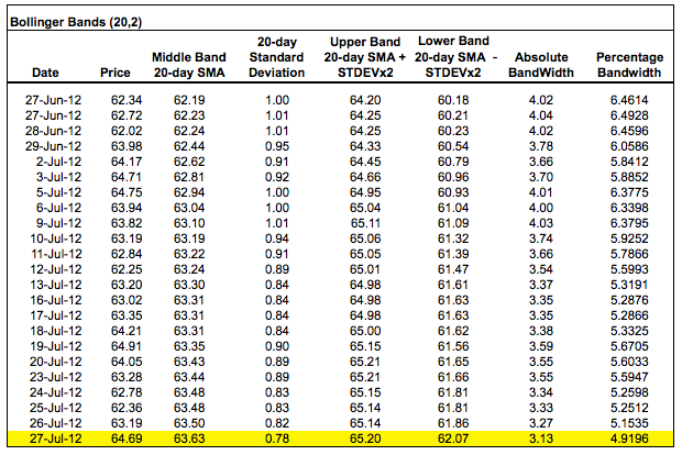
When calculating BandWidth, the first step is to subtract the value of the lower band from the value of the upper band. This shows the absolute difference. This difference is then divided by the middle band, which normalizes the value. This normalized Bandwidth can then be compared across different timeframes or with the BandWidth values for other securities.
The chart below shows the Nasdaq 100 ETF (QQQ) with Bollinger Bands, BandWidth, and the Standard Deviation.
Notice how BandWidth tracks the Standard Deviation (volatility). Both rise and fall together. The image below shows a spreadsheet with a calculation example.
Narrow BandWidth is relative. BandWidth values should be gauged relative to prior BandWidth values over a period of time. It is important to get a good look-back period to define BandWidth range for a particular ETF, index, or stock. For example, an eight- to 12-month chart will show BandWidth highs and lows over a significant timeframe. BandWidth is considered narrow as it approaches the lows of this range and wide as it approaches the high end.
Securities with low volatility will have lower BandWidth values than securities with high volatility. For example, the Utilities SPDR (XLU) represents utility stocks, which have relatively low volatility (see lower chart). The Technology SPDR (XLK) represents technology stocks, which have relatively high volatilities. Because of lower volatility, XLU will have consistently lower BandWidth values than XLK. The 200-day moving average of XLU BandWidth is below five, while the 200-day moving average of XLK BandWidth is above seven.
Bollinger BandWidth is best known for identifying The Squeeze. This occurs when volatility falls to a low level, as evidenced by the narrowing bands. The upper and lower bands are based on the standard deviation, which measures volatility. The bands narrow as price flattens or moves within a relatively narrow range. The theory is that periods of low volatility are followed by periods of high volatility. Relatively narrow BandWidth (a.k.a. the Squeeze) can foreshadow a significant advance or decline. After a Squeeze, a price surge and subsequent band break signal the start of a new move. A new advance starts with a Squeeze and subsequent break above the upper band. A new decline starts with a Squeeze and subsequent break below the lower band.
The chart below shows Alaska Airlines (ALK) with a squeeze in mid-June. After the April–May decline, ALK stabilized in early June as Bollinger Bands narrowed. BandWidth dipped below 10 to put the Squeeze play on in mid-June. Keep in mind that 10 refers to 10%. In other words, the width of the bands is equal to 10% of the middle band. Even though this level seems high, it is actually quite low for ALK. With the stock trading at around $15–$16, BandWidth was less than 10% and at its lowest level in over a year. With the subsequent surge above the upper band, the stock broke out to trigger an extended advance.
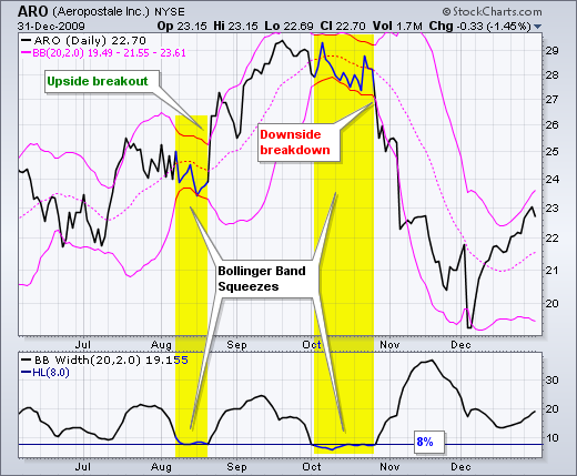
The chart below shows Aeropostale (ARO) with a couple of Squeezes. A horizontal line was added to the indicator window. This line marks 8, which is deemed relatively low based on the historical range. The BandWidth indicator alerted traders to be ready for a move in mid-August. Note that the stock surged above the upper band and continued higher throughout September. The advance stalled in late September and BandWidth narrowed again in October. Notice how BandWidth declined below the lows set in August and then flattened out. The subsequent break below the lower Bollinger Band triggered a bearish signal in late October.
The Squeeze can also be applied to weekly charts or longer timeframes. Volatility and BandWidth are typically higher on the weekly timeframe than a daily timeframe. This makes sense because larger price movements can be expected over longer timeframes.
The chart below shows Barrick Gold (ABX) consolidating throughout 2006 and into 2007. As the consolidation narrowed and a triangle formed, Bollinger Bands contracted and BandWidth dipped below $10 in January 2007. Notice how BandWidth remained at low levels as the consolidation extended. A bullish signal triggered with the breakout in July 2007. BandWidth also rose as prices moved sharply in one direction and Bollinger Bands widened.
The chart below shows Honeywell (HON) with an extended trading range in the $50–$55 area. There was a move to the upper band in May, but no breakout for a signal. Instead, HON clearly broke below the lower band to trigger a bearish signal in June 2007.
Derived from Bollinger Bands, the BandWidth indicator is a tool to identify periods of low and high market volatility. This, in turn, can give you some insight into potential market movements. The direction depends on the subsequent band break. The condition known as “The Squeeze” happens when the BandWidth is at a historically low level, suggesting that a significant price move is imminent, more or less. Once you identify the squeeze, it's time to watch for a breakout above the upper band, indicating an upward trend, or a break below the lower band, hinting at a downward trend. Like all indicators, you should approach its signals with caution, as initial breaks can sometimes fail, and not all signals are reliable.
Bollinger BandWidth can be found in the indicator list on SharpCharts. The default parameters (20,2) are based on the default parameters for Bollinger Bands. These can be changed accordingly. 20 represents the simple moving average. 2 represents the number of standard deviations for the upper and lower band. BandWidth can be positioned above, below or behind the price plot. Click here to see a live example of BandWidth.
You can compare BandWidth for several securities by using normalized Bollinger BandWidth in MarketCarpet. Using the S&P Sector MarketCarpet as an example, choose Bollinger BandWidth from the Measurements dropdown menu. From the Color By dropdown menu, select Latest Value to view absolute levels.
If you're using the Red to Green color scheme, the darker green boxes identify stocks with relatively wide BandWidths. The lighter colored boxes represent stocks with relatively narrow BandWidths (see legend below the MarketCarpet).
Hover your mouse over any box to view a mini price chart of the stock. To find more details, double-click on the box. This will take you to the Symbol Summary page of the specific stock.
In addition to viewing the stocks as a MarketCarpet, you can view them as a list by clicking the Table button. This lists all the stocks which you can sort in ascending or descending order.
If you wish to dive into each sector, click on the sector heading (e.g. Technology). This allows you to view all stocks within a sector that have wide or narrow BandWidths.
This scan reveals stocks whose Bollinger Bands just expanded rapidly after being contracted for 5 or more days.
For more details on the syntax to use for BandWidth scans, please see our in the Support Center.